The Compassion Design System
Introduction
Scaling a unified brand identity was a significant challenge at Compassion International, a global organization with 13 independent fundraising offices. As the Senior Manager of UX, I envisioned and architected a token-based, themeable design system that bridged the gap between design and dev. We built the Compassion Design System to accelerate the design and development process and address fragmentation across Compassion’s diverse global offices.
Problem Statement
Unraveling the ChallengesCompassion’s decentralized corporate structure makes coordination among offices challenging. While it allows each office to adapt to its local conditions nimbly, it also leaves each office individually responsible for interpreting and implementing Compassion’s brand. Over time, this isolation resulted in a fragmented brand and visual identity that left Compassion as a whole less capable of leveraging its internal design and development expertise because teams constantly reinvented the wheel. Compassion’s ongoing multi-year brand overhaul compounded this issue, which called for a unified global voice to solidify its brand identity.
Research and Discovery
Delving into the DetailsWe followed this with a global component and technology audit, which further underscored the extent of the existing fragmentation. Some partners used React, others were on WordPress, and one was on .NET. Many had plans to migrate to Next.js or to introduce a mobile app. The component audit revealed extensive fragmentation brought about by the siloed nature of the organization. For instance, Compassion was using 109 types of Buttons and 23 different Card components.
Strategic Vision
Crafting the Design System BlueprintOur strategy was clear: we aimed to create a design system with vast flexibility and adaptability. This system was architected to empower desginers’ creativity across Compassion’s global network while setting a clear vision for unification. Given the ongoing brand overhaul, the system needed to be adaptable, allowing for effortless flow from design to development as the brand evolved. Design tokens emerged as a critical enabler of our solution, ensuring the system was genuinely future-proof and enabling flexibility where designers needed it.
Building Buy-In
Steering the Cruise ShipThe design and development of the Compassion Design System was user-centered and iterative. We conducted additional user interviews to understand the needs of our global teams and what would make the components most flexible, both in Figma and in code. The team carefully considered the most minor details, like naming design tokens, to ensure clarity and consistency.
We partnered with teams across Compassion to establish a robust governance model and a streamlined design-to-development workflow. This workflow included tools and processes such as Figma for design, Tokens Studio for managing design tokens, GitHub for version control, Style Dictionary for transforming tokens into usable formats, coded components, Storybook for documentation, and an npm package for developers. This comprehensive approach facilitated a seamless workflow between designers and developers.
Bringing the Vision to Life
Understanding Our UsersIn the implementation phase, we built a comprehensive library of Figma components and distributed them across the organization as a shared library. We created a lighthearted onboarding Figma file to introduce the system to designers worldwide. Working closely with stakeholder development teams, we built robust coded components for React and HTML/SCSS. We then gathered and incorporated feedback from additional development teams to inform the creation of React Native components. The team implemented automated visual regression testing to maintain consistency and quality across frameworks, ensuring our design system performed reliably across all platforms.

Impact and Outcomes
Measuring SuccessThe design system had significant positive outcomes, and teams across the organization were in various stages of adoption, including:
- Partners in IT
- Compassion’s Global Marketing team
- Compassion Canada
- Compassion Ventures Group (Compassion’s innovation department)
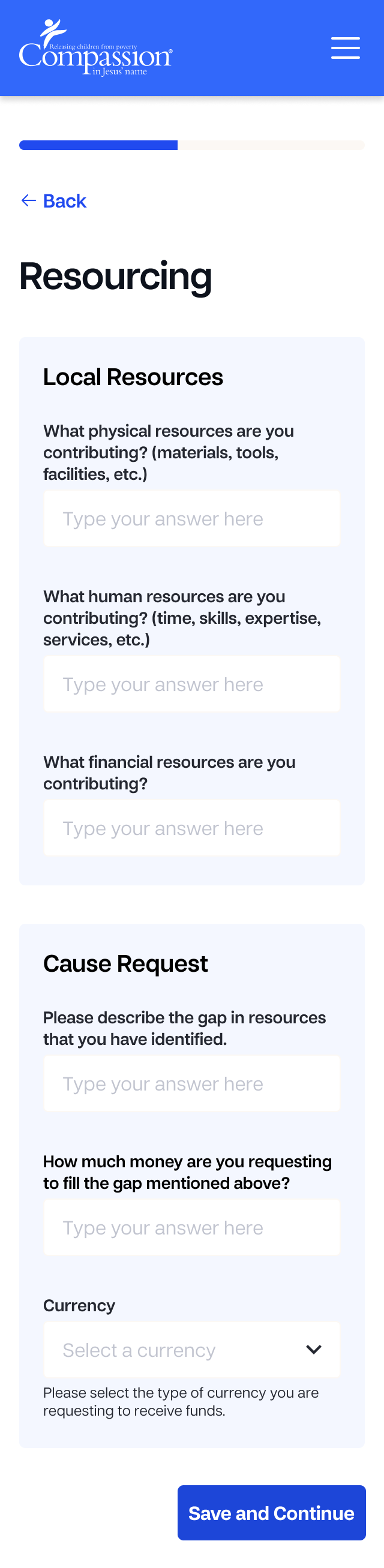
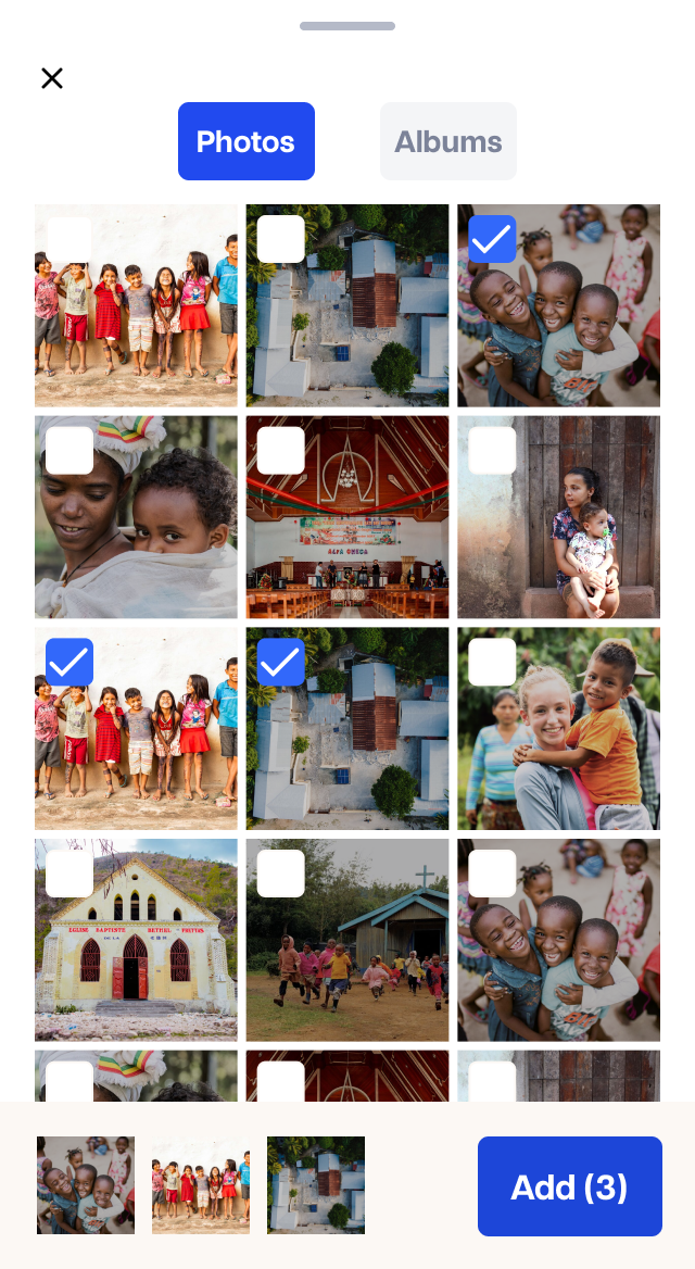
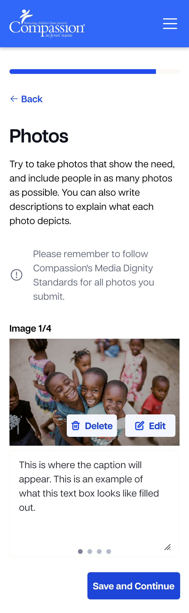
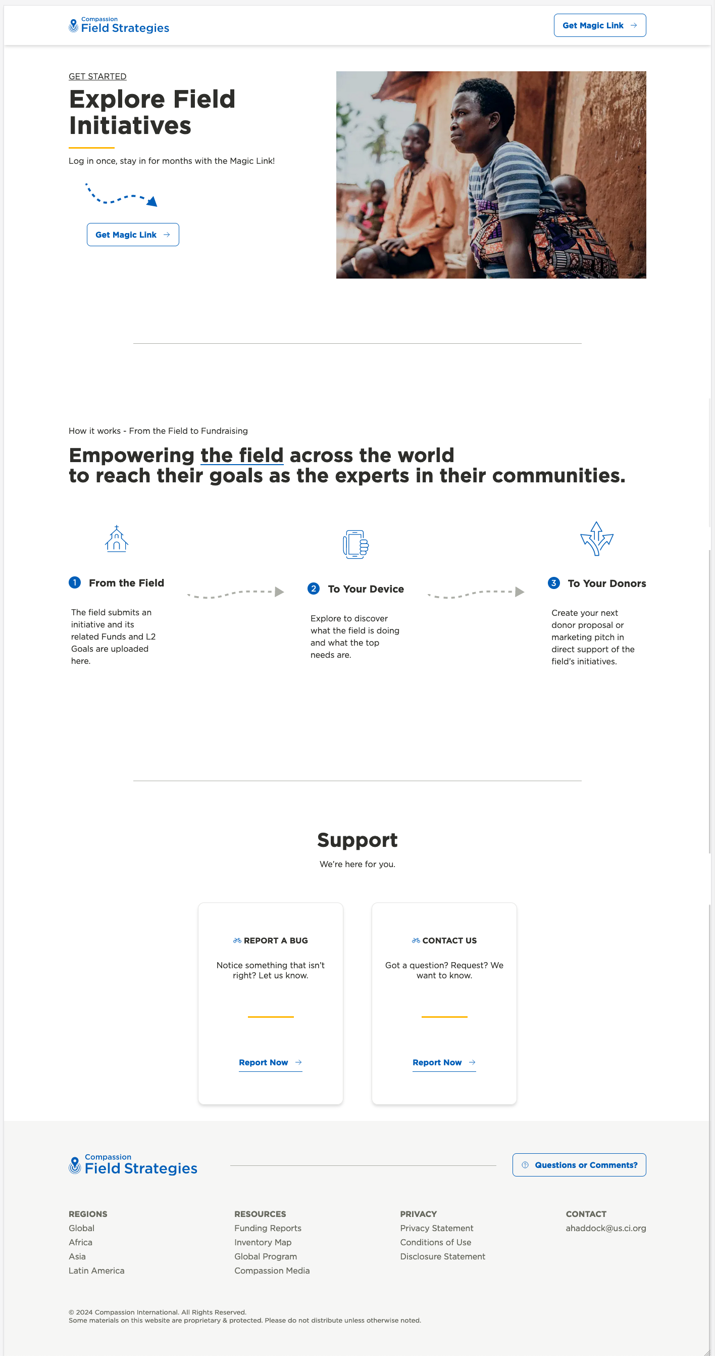
Notably, the Compassion Design System accelerated the Field Strategies app, a crucial tool in a $1.4 billion multi-year fundraising effort, and many global campaign sites and marketing landing pages.
The Compassion Design System’s qualitative benefits were substantial. The system improved design consistency, reduced development cycles, and enhanced collaboration between design and development teams. While formal metrics were unavailable, the positive feedback from adopting teams and the visible improvements in design efficiency and consistency demonstrated the system’s value.


Key Insights
Lessons Learned and Future DirectionsThe project highlighted several vital lessons. One critical insight was the necessity of solid alignment and endorsement from leadership to achieve widespread adoption. Despite having robust grassroots support from many teams, after leadership turnover, the design system lacked the top-down commitment and advocacy that would have been crucial in ensuring its long-term success and integration across the entire organization. This knowledge equipped the team to navigate similar situations in the future with greater confidence and effectiveness.
Looking ahead, we identified potential improvements, such as applying the tokens to a library like Ariakit or ShadCN UI to accelerate the maintenance of accessible coded components even further. This approach would enhance efficiency and scalability, allowing our design and development partner teams to focus even more on driving innovation with the Compassion Design System.